in a view provides a shortcut to controlling
all of these grid properties.
in a view provides a shortcut to controlling
all of these grid properties.The Display Options window
in a view provides a shortcut to controlling
all of these grid properties.
|
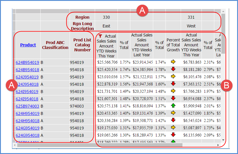
Lock Rows and Columns - Select this option to “lock” captions and level related data in rows and columns when scrolling through view results. Captions for levels and attribute relationships will remain visible and locked in position at all times as you scroll through a view to look at measure item values. In the following example, items in the areas marked by the letter A will remain in a locked and visible position as you scroll up, down, left, or right to see the rest of the level members, Actual Sales Amount, and Percent of Total data in the view (the area marked by letter B).
|
|
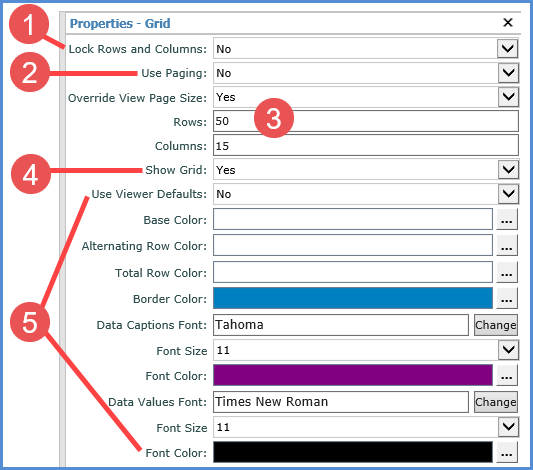
Use Paging - Yes means the view uses paging, and Stratum.Viewer will display view results a page at a time. Default page size properties in the application control the number of rows and columns. In the example above, up to 50 rows and 10 columns will display per page. You can customize a view’s page size with the Override View Page Size property. Change the Use Paging property to No to show all rows and columns on a single page. Note: Showing all rows and columns rather than using paging can result in delays when refreshing a view depending on the amount of members and data in the view. |
|
Override View Page Size – When set to Yes, you can control the page size for this view. Enter a numeric value in the Rows and Columns fields. |
|
Show Grid – Use this setting when working with charts. Change the setting to No to hide the grid and only display the chart. |
|
Use the following set of properties to customize the look of the grid including background color, borders, and fonts. Examples of ways to customize the grid format are shown in Customizing The Grid Formatting For Views:
|