|
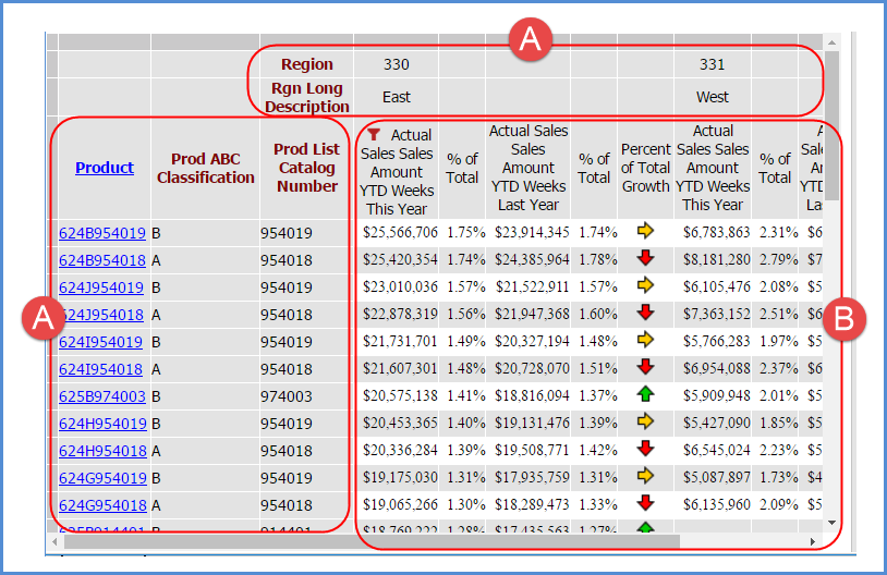
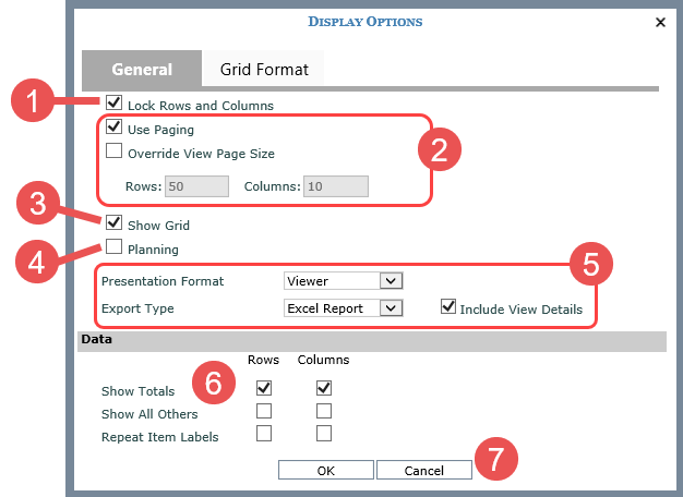
Lock Rows and Columns – Select this option to “lock” captions and level related data in rows and columns when scrolling through view results. Captions for levels, attribute relationships, and measure items will remain visible and locked in position at all times as you scroll through a view to look at measure item values. In the following example, items in the areas marked by the letter A will remain in a locked and visible position as you scroll up, down, left, or right to see the rest of the level members, Actual Sales Amount, and Percent of Total data in the view (the area marked by letter B).
|
|
Use Paging – Select this property to display the view results a page at a time. In the example above, up to 50 rows and 10 columns will display per page. You can customize a view’s page size with the Override View Page Size property. Override View Page Size – Select the property if you want to customize the page size for this view Enter a numeric value in the Rows and Columns fields. |
|
Show Grid - Use this property when working with charts. Deselect the property to No to hide the grid and only display the chart. |
|
Planning – Use this property to enable or disable a view’s planning properties. If you select this checkbox, the view must also meet other requirements for planning activities in order for users to utilize its planning capabilities. For example, there needs to be measure items in the view that are enabled for editing in your Stratum.Viewer environment. See the Working With Planning section of Stratum.Viewer online help for details. |
|
Presentation Format - Use to change the format in which the view displays. When Viewer is selected, the view displays in the traditional grid format. When Excel is selected, the View Definition window will display in the background while the view opens as an MS Excel file. A File Download window will prompt you to open or save the file. Export Type – This property determines the format of Excel exports for views that have their Presentation Format set to Excel. The Excel Report format will export all data and charts in the view, using the formatting that you normally see in the view. The Excel Data option will export the view data only without any special formatting applied to it. Include View Details – This property determines if the View Details tab or section will appear in exported and emailed views. View Details show as a tab in exported files and a section in emailed views. Details are included by default and show things like counts for rows and columns, filtering details, and the view name. Deselect this option to exclude view details from exported and emailed views. |
|
Data – Select or deselect options in this part of the window to determine whether or not totals, All Others data (related to filtering), and repeating labels will show on rows and columns.
|
|
OK / Cancel – Use buttons at the bottom of the window to refresh a view with your changes or cancel changes. Save the view if you want your display changes to be retained for the next time the view is run. |
|
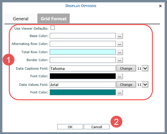
Use the Grid Format tab to customize the look of the grid such as background colors, borders, and fonts. Examples of ways to customize the grid format are shown in Customizing The Grid Formatting For Views:
|
|
OK / Cancel – Use buttons at the bottom of the window to refresh a view with your changes or cancel changes. Save the view if you want your display changes to be retained for the next time the view is run. |