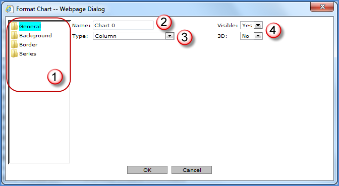
You control the format of the chart as well as the area surrounding it. The state of the following windows depends on the folder selected in the left side of the window:

|
The chart characteristics being maintained depend on the folder selected. Note: The Series folder does not display for dynamic charts. |
|
Name - Determines the unique name to be associated with the chart. The name defaults to Chart #. For example, Name will default to Chart 0 for the first chart added to a view, to Chart 1 for the next chart, and so on. This is different from the chart title, which defaults to the view name; the chart title is what displays within the chart area and within the view explorer Charts folder. |
|
Type - Determines the chart type. Options are Area, Bar, Bubble, Column, Combinational, Doughnut, Line, Pie, Point, Spline, Spline Area, Stacked Area, Stacked Area (100%), Stacked Bar, Stacked Bar (100%), Stacked Column, Stacked Column (100%), and Step Line. Refer to the Overview of Chart Types for definitions of each chart type. |
|
Visible - You control whether or not the chart is visible. If you select No to hide the chart, it can be made visible again via view explorer. For more information, see the Hide a Chart topic. 3D - You control whether or not the chart displays three dimensional. |
|
The
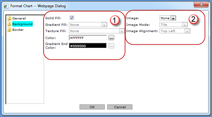
background of the chart can be customized with solid, gradient,
or textured colors. The Browse button |
|
Image - You can select an image which had been saved to the images\charting\backgrounds\folder of the Stratum.Viewer product directory. This functionality is disabled if there is not an image available. Valid image types are .gif, .jpg, .tif, bmp, and .png. Image Mode - If an image is included in the chart background, it can be tiled, flipped, or scaled. Image Alignment - If an image is included in the chart background, you determine where it will be positioned. |
|
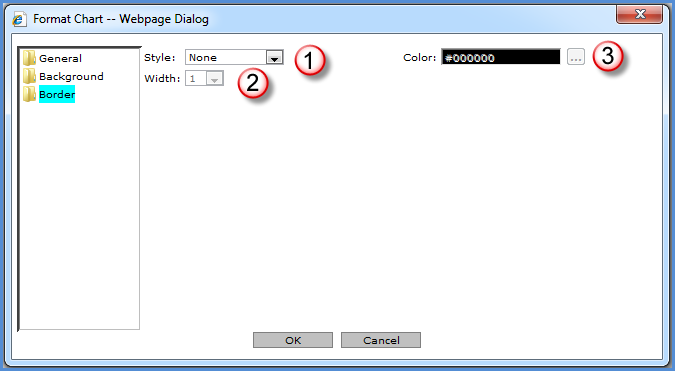
Style - A border can be defined for the chart. If a style is selected, the Color and Width properties are enabled. Styles to choose from are Dash, Dash Dot, Dash Dot Dot, Dot, and Solid. You must select a width and color for the specified border style to be visible. |
|
Width - Specify a width of 1 to 10 for the chart legend border. |
|
Color
- The Browse button |
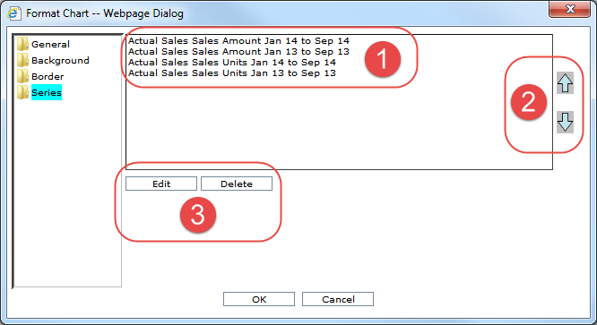
If the series has been defined as static for the chart, you can change the order that the series appear in the chart as well as access formatting options for each series. The Series folder does not display for dynamic charts.
|
All of the chart’s series display in this area and are available to select for maintenance, deletion, or reordering. |
|
Reorder
Buttons - Clicking the
Up Arrow button |
|
|