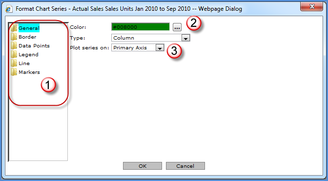
You control the format of a chart’s static series. The state of the following windows depends on the folder selected in the left side of the window. Edits must be made to each series individually. Changes can be made on all the various folders and all edits will apply to the selected series.

|
The chart series characteristics being maintained depend on the folder selected. |
|
Color -
The Browse button Type - The chart type. This field is display-only unless you are maintaining the series of a combinational chart. This allows you the ability to define a chart type for each series of a combinational chart. |
|
Plot series on - Choose whether you want the series to plot on the primary or secondary axis. |
|
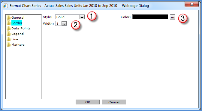
Style - If a style is selected, the Width and Color properties are enabled. Styles to choose from are Dash, Dash Dot, Dash Dot Dot, Dot, and Solid. You must select a width and color for the specified border style to be visible. |
|
Width - Specify a width of 1 to 10 for the series border. |
|
Color -
The Browse button |
|
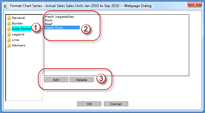
Data Points - This folder only displays when data points are static.
|
|
All static data points for the selected series display in this area. Select a data point to maintain or delete from the chart.
|
|
Edit or Delete - Click Edit to maintain the selected data point’s color, labels, and legend in the chart. Delete will remove the data point for the selected series from the chart. |
|
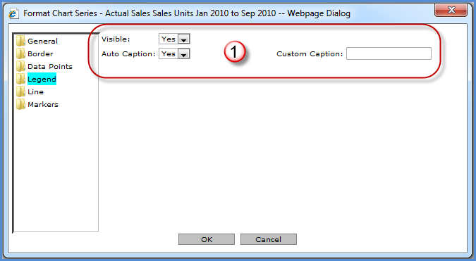
Visible - You control whether or not the legend is visible within the chart area. Auto Caption – If set to Yes, the legend label for the series comes from the caption displayed in the view grid. Custom Caption - If Auto Caption is No, then a custom caption can be entered in this field. The custom caption defined for the series will display in the legend. |
Note: Line folder is only available if the series being formatted is for a Line, Spline, or Step Line chart.
|
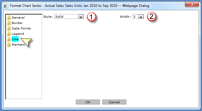
Style - If a style is selected, the Width property is enabled. Styles to choose from are Dash, Dash Dot, Dash Dot Dot, Dot, and Solid. |
|
Width - Specify a width of 1 to 10 for the chart series line. |
|
Border
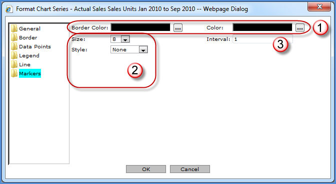
Color - The Browse button Color - The
Browse button |
|
Size - Specify a marker size by selecting one from the drop-down list. Style - Marker styles to choose from are: Circle, Cross, Diamond, Square, Star 10, Star 4, Star 5, Star 6, Triangle, and None. |
|
Interval - Controls the frequency of the displayed markers for the selected series. An interval of 1 will have a marker at each data point. An interval of 3 will display a marker for every third data point, and so forth. If a marker has been defined, but no Interval is specified then markers will display at every data point. |