Choosing the correct chart type and the correct information is the key to a successful chart. A good chart easily conveys a message and uses an appropriate chart type. A bad chart contains too many data points or series; contains disperse data so the scaling is meaningless; or contains data that is very similar so everything looks the same. Stratum.Viewer supports the following chart types:
Area |
Bar |
Bubble |
Column |
Combinational |
Doughnut |
Line |
Pie |
Point |
Spline |
Spline Area |
Stacked Area |
Stacked Area (100%) |
Stacked Bar |
Stacked Bar (100%) |
Stacked Column |
|
Stacked Column (100%) |
Step Line |
|
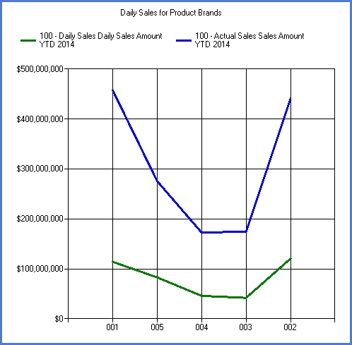
Line and Area charts show continuous data revealing trends and relationships between data points. If you want to emphasize trends themselves over quantities, use a line chart. Use an Area chart to show the trend of one or more series over time with an emphasis on quantities. An example of a Line chart follows.
Area charts show trends in values, just as line charts do, but they also show the relation of parts to the whole and to each other. The Area chart consists of one or more lines drawn on a grid with the areas in between filled in. With this solid look, Area charts convey more emphasis on quantities. If creating an Area chart, plot at least two series. You should not combine positive and negative values in an area chart - the values should be all positive or all negative.
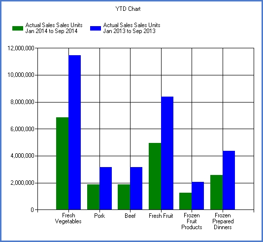
Bar or column charts are good when you’re plotting data that spans many periods of time, or has large fluctuations from time period to time period. They can be used to show how something changes over time or to compare items. The height of the column or the length of the bar corresponds to the amount being compared. You can combine positive and negative values – negative numbers appear as columns extending below the horizontal axis. You should consider using a Bar chart when you have multiple sets and want to highlight the progression of values with a set. The vertical bars of a Column chart type effectively display a trend, and the horizontal bars of a Bar chart type work best when you don’t want to communicate a trend.
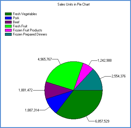
Pie charts consist of a circle (“pie”) divided into two or more sections (“slices”) and are not drawn on any type of grid. Use a Pie chart to chart a single series when your primary message is the relationship of the parts to the whole represented as percentages at a set point in time. . Within a Pie chart, each datapoint is represented by a “slice” of the pie, and the entire pie represents a single series.
Doughnut charts show each category’s part of the whole. Just like the pie chart, it must be clearly marked to easily tell what each slice represents. They are used to compare a small number of values, and it is best when the value of each component is not similar.
Recommendation: To keep the Pie chart readable and allow easy comparisons, avoid dividing the pie into more than six or seven pieces, and plot either all positive or all negative values.
Bubble charts let you chart three variables in two dimensions. All three variables are independent, and you choose what displays on the X axis, Y axis, and bubble size. The size of each bubble is typically used to represent importance. For example; the Return % could be the X axis, the Gross Margin % is the Y axis, and the Sales Amount is the size of the bubble.
A Point chart shows the relationship between two sets of numeric values. Other chart types have values along one axis and data points in the other. Point charts have numeric values plotted along both axes, displaying the relationship between the two variables.
Stacked charts allow the comparison of different sets of data (series) across the same set of data (data points). They show segments of totals based on the amount or percentage of the total. Only a few items can be effectively displayed in each stack. Each stack is a data point, and each portion of the stack is a series. The following Stacked chart types are supported:
Stacked Column Chart
Stacked Bar Chart
Stacked Bar (100%) Chart
Stacked Column (100%) Chart
Stacked Area (100%) Chart
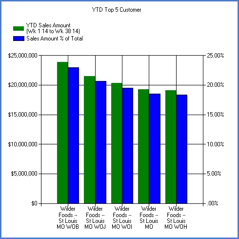
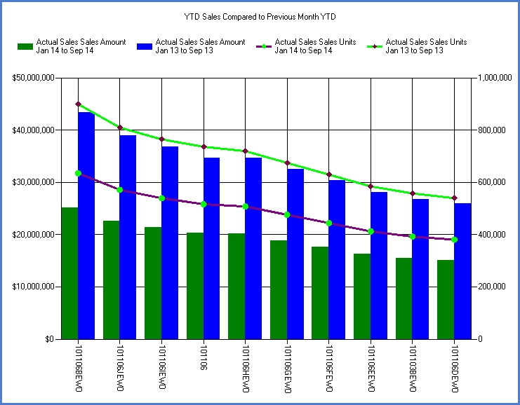
A Combinational chart uses two or more chart types in the same chart area to emphasize that the chart contains different sets of information. For example, you could use a column chart to display sales data and a line chart to display budget data. Each chart type is defined individually. An example of a Combinational chart follows:
Dual axis charting lets you build charts with a primary and secondary axis. This feature produces charts that show data of different scales side by side in a meaningful way. Separate scaling and formatting can be set up for each axis. Use a dual axis chart when you want to show data of different scales side by side. For example, when you want to show freight costs and average selling price in the same chart.