
|
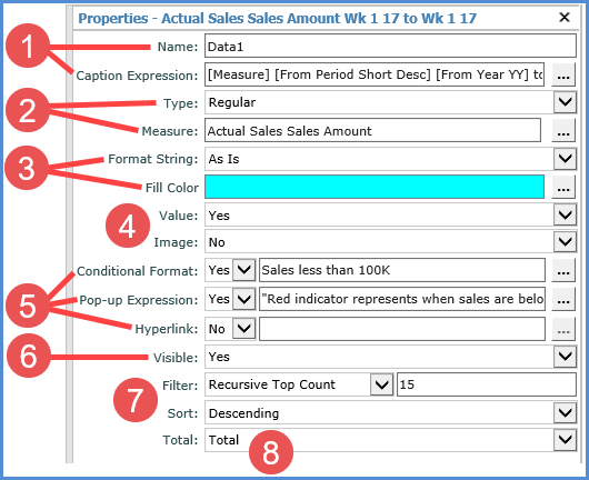
Name – The text in this field determines the unique name that Stratum.Viewer will use to identify a measure item in the view. You can edit this field as needed. Default names given to new measure items are DataN. The “N” is a sequential number assigned by Stratum.Viewer to create a unique name. You will be prompted to make corrections to the name if you enter a duplicate name, use any spaces in the name, use too many characters (more than 50), or use invalid characters. Caption Expression – A read only field that shows the expression behind the caption for a measure item. The resolved text generated by the expression creates the caption, which is the text that displays for the measure item in the view and other areas of the application such as view explorer. The Caption Expression window can be accessed for editing the expression by clicking the Browse button next to the field. See Creating Expressions for Captions. |
|
Type – This property shows the type of measure item you are working with – either regular, calculated, or distinct calculated. The property will be set to “Regular” if you are inserting or editing a regular measure item. Note: See the next table for information about calculated and distinct calculated types. Measure – This field is a read only field that displays the underlying measure you selected when setting up the regular measure item.
|
|
Format String – Use this drop-down list to apply a format such as decimal places, monetary symbols, commas, or a combination of formatting. Fill Color
–
Assign a fill color that will be used in the column or row containing
the measure item. This makes it stand out from the rest of the
grid. Click the Browse button |
|
Value – Determines if the measure item value displays in the Viewer grid. Set to Yes to display value. Set to No to hide the value, for example, in cases where you want to display only the conditional format icon for a measure item. Image –
This property is used when setting up calculated measure item |
|
Conditional
Format –
Controls
the display of icons, and cell and text formatting for the measure
item by applying the conditional format rules. The
Browse button Pop-up
Expression – Use
this property to specify whether the selected measure item has
a pop-up label that will display when you hover over the measure
item value, indicator, or image. The Browse button  is only enabled
when the Hyperlink field is set to Yes. When enabled, you can
click the button to access the Hyperlink Expression window to
edit the expression or create a new one. The hyperlink
defined displays in the text box left of the is only enabled
when the Hyperlink field is set to Yes. When enabled, you can
click the button to access the Hyperlink Expression window to
edit the expression or create a new one. The hyperlink
defined displays in the text box left of the  icon. See Hyperlink Expression window. icon. See Hyperlink Expression window.
|
|
Visible – Set this property to No to hide the measure item in the view. Set this property to Yes to display the measure item in the view. |
|
Filter and Sort – Use to add, edit, or remove filters and sorts. For filters, select the operator from the drop-down list and enter the value to filter by in the field next to the list. Pop-up labels showing filter criteria will show for the Filter field after a filter has been applied. If your view has levels on the same axis as measure items, these properties will be disabled until you have applied an initial filter or sort via the grid. See also Working with Filters and Working with Sorts. |
|
Total – Use to control the type of total that is performed for a measure item. The default setting for all measure items is Total.
|

|
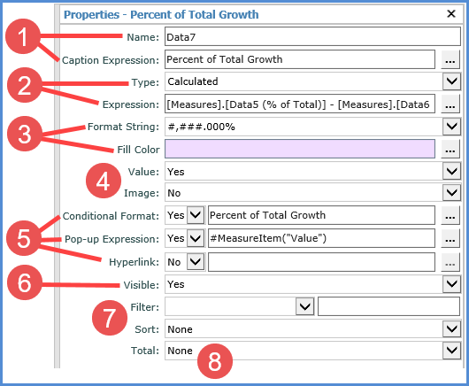
Name – The text in this field determines the unique name that Stratum.Viewer will use to identify a measure item in the view. You can edit this field as needed. Default names given to new measure items are DataN. The “N” is a sequential number assigned by Stratum.Viewer to create a unique name. You will be prompted to make corrections to the name if you enter a duplicate name, use any spaces in the name, use too many characters (more than 50), or use invalid characters. Caption Expression – A read only field that shows the expression behind the caption for a measure item. The resolved text generated by the expression creates the caption, which is the text that displays for the measure item in the view and other areas of the application such as view explorer. The Caption Expression window can be accessed for editing the expression by clicking the Browse button next to the field. See Creating Expressions for Captions. |
|
Type – This property shows the type of measure item you are working with – either regular, calculated, or distinct calculated. The property will be set to “Calculated” or “Distinct Calculated” if you are inserting or editing that type of measure item. Note: See the previous table for information about regular types. Expression
– When "Calculated" or "Distinct Calculated"
is the measure item type, an Expression field shows in this window.
It's a read only field that shows the expression for calculating
the measure item. The Expression
window can be accessed for editing the expression by clicking
the Browse button Note that when you are using a calculated measure item to display images in a view that the expression will determine the location/name of the image file for Stratum.Viewer to display.
|
|
Format String – Use this drop-down list to apply a format such as decimal places, monetary symbols, commas, or a combination of formatting. Fill Color
–
Assign a fill color that will be used in the column or row containing
the measure item. This makes it stand out from the rest of the
grid. Click the Browse button |
|
Value – Determines if the measure item value displays in the Viewer grid. Set to Yes to display value. Set to No to hide the value, for example, in cases where you want to display only the conditional format icon for a measure item. Image – This property is used when setting up calculated measure items that display images. You use the Expression window to define the location of the image and then set this property to Yes in order for the defined image to display in the grid. See item 2 above and also Display Images for Measure Items. |
|
Conditional Format – Controls the
display of icons, and cell and text formatting for the measure
item by applying the conditional format rules. The Browse button
Pop-up
Expression – Use
this property to specify whether the selected measure item has
a pop-up label that will display when you hover over the measure
item value, indicator, or image. The Browse button Hyperlink – Choose Yes if you want a hyperlink
defined for the cell of a measure item. The Browse button
|
|
Visible – Set this property to No to hide the measure item in the view. Set this property to Yes to display the measure item in the view. |
|
Filter and Sort – Use to add, edit, or remove filters and sorts. For filters, select the operator from the drop-down list and enter the value to filter by in the field next to the list. Pop-up labels showing filter criteria will show for the Filter field after a filter has been applied. If your view has levels on the same axis as measure items, these properties will be disabled until you have applied an initial filter or sort via the grid. See also Working with Filters and Working with Sorts. |
|
Total – Use to control the type of total that is performed for a measure item. The default setting for all measure items is Total.
|