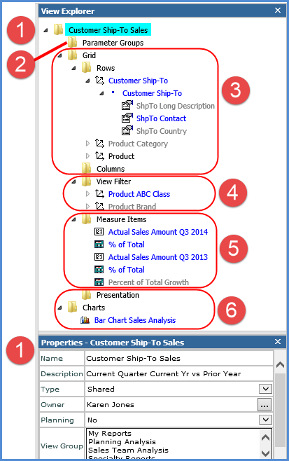
The elements in view explorer are organized into a tree structure that has expandable/collapsible folders. Folders are described in the following table. Color-coding is used throughout to help you distinguish which items will be visible in the grid and which are hidden.
Items in blue text – Any items currently shown in the grid. Their Visible property is “Yes” in their Properties window.
Items in black text – Any items that are not actively shown in the grid, but that have a Visible property of “Yes.” This means they will display in the grid once you reach them in the drill down path for the view.
Items in grey text – Any items that have a Visible property of “No.” For levels, this means they will not display in the grid as you drill through it. Attribute relationships, measure items, and charts displayed in grey text also will not display in the grid. You can right-click on them anytime and select Show to make change their Visible property.
When you click an item, it is highlighted in a bright blue box like the view name, “Customer Ship-To Sales,” in the above example. When double-clicked, the Properties window of the active item opens at the bottom of the view explorer as shown in the above example. You can also right-click to invoke a pop-up menu of actions to take on items from view explorer. See also View Explorer Pop-up Menus.
|
|
View name folder – displays the name of the view. Double-click to access the Properties window for editing basic properties like the Name, Type, Planning, View Group properties, and when the view was last used or updated. Administrators can use the Owner property to change the owner of a view. |
 |
Parameter Groups folder – for parameter groups and parameters within each group. As you insert groups and parameters, they will display under this folder. Each group and parameter has a related Properties window. You can drag and drop groups and parameters within each group to rearrange them. |
|
|
Grid folder – The folders for Rows, Columns, View Filters, and Measure Items are organized under the Grid folder. From the Grid folder, you can access a Grid Properties window which determines if the grid is visible and if paging is enabled for the grid display. Rows and Columns folders – All of the included levels and attribute relationships, grouped by hierarchy, display appropriately in the Rows and Columns folder. You can move hierarchies along with their levels and attribute relationships between the Rows, Columns, or View Filter by dragging and dropping them within view explorer or into the grid from view explorer. Properties windows exist for hierarchies, levels, and attribute relationships in these folders. Use them to hide or show items, set up filters or sorting, control the display of totals and All Others value defaults, etc.
|
|
|
View Filter folder – Levels included in the view filter. Setting up a view filter requires a level to be in the View Filter section and then applying a filter to that level. Drag or drop the desired level(s) into the View Filter section of the grid or into the View Filter folder of view explorer. |
 |
Measure Items folder – All measure items defined for this view display in the folder. You can edit, insert, remove and hide measure items from this folder. The Time Range controls the type of measure items that you can set up for the view – either measure items with time ranges (Yes) or measure items without time ranges (No). See the Measure Items properties window for detailed information. You can also use the Properties windows for individual measure items to change their caption, images, conditional formatting, pop-up labels, hyperlinks, filtering, sorting, totals, etc.
|
|
|
Presentation folder – The properties for this folder are used to set the default presentation format for the view (either Viewer or Excel) and to determine whether or not users will be prompted to choose the presentation format before the view opens for them. Chart folder – The Chart folder displays the names of any charts |


 – Blue boxes next to a level indicate the level it is based for all the levels in its hierarchy. For example, a level with one box next to it would be the first level for its hierarchy. A level with two boxes next to it would be the second level available in its hierarchy, and so forth.

