Introduction to Charts
Charts communicate
information visually, and they make it easy for you to see comparisons,
patterns, and trends in data. For instance, rather than having to analyze
several columns of worksheet numbers, you can see at a glance whether
sales are rising or falling over a given period of time, or how the actual
sales compare to the projected sales. Sometimes, your data needs to be
presented in a chart to help identify trends.
Stratum.Viewer’s
charting functionality supports over 15 different chart types, dual axis
charts, and charts that show totaling and All Others summary data. You
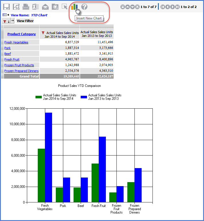
can chart all rows and columns of data by clicking the Insert New Chart
icon  and making a few quick selections
in the Chart Wizard.
You can also control many formatting characteristics in the chart and
the area surrounding the chart. In addition, you can create multiple
charts for a view, display or hide each one, or even hide the grid and
display only the chart(s) for a view.

 and making a few quick selections
in the Chart Wizard.
You can also control many formatting characteristics in the chart and
the area surrounding the chart. In addition, you can create multiple
charts for a view, display or hide each one, or even hide the grid and
display only the chart(s) for a view.